What makes a brand look and feel ethereal?
How do you achieve that airy fantasy world with a well-balanced color palette?
What colors should be used in order to reflect what your ethereal brand stands for?
With color psychology, you can use the power of colors to ensure that every part of your branding looks and feels magical – if you understand it correctly.
Find out all about this amazing tool in this article!
Pin this image for later inspiration!
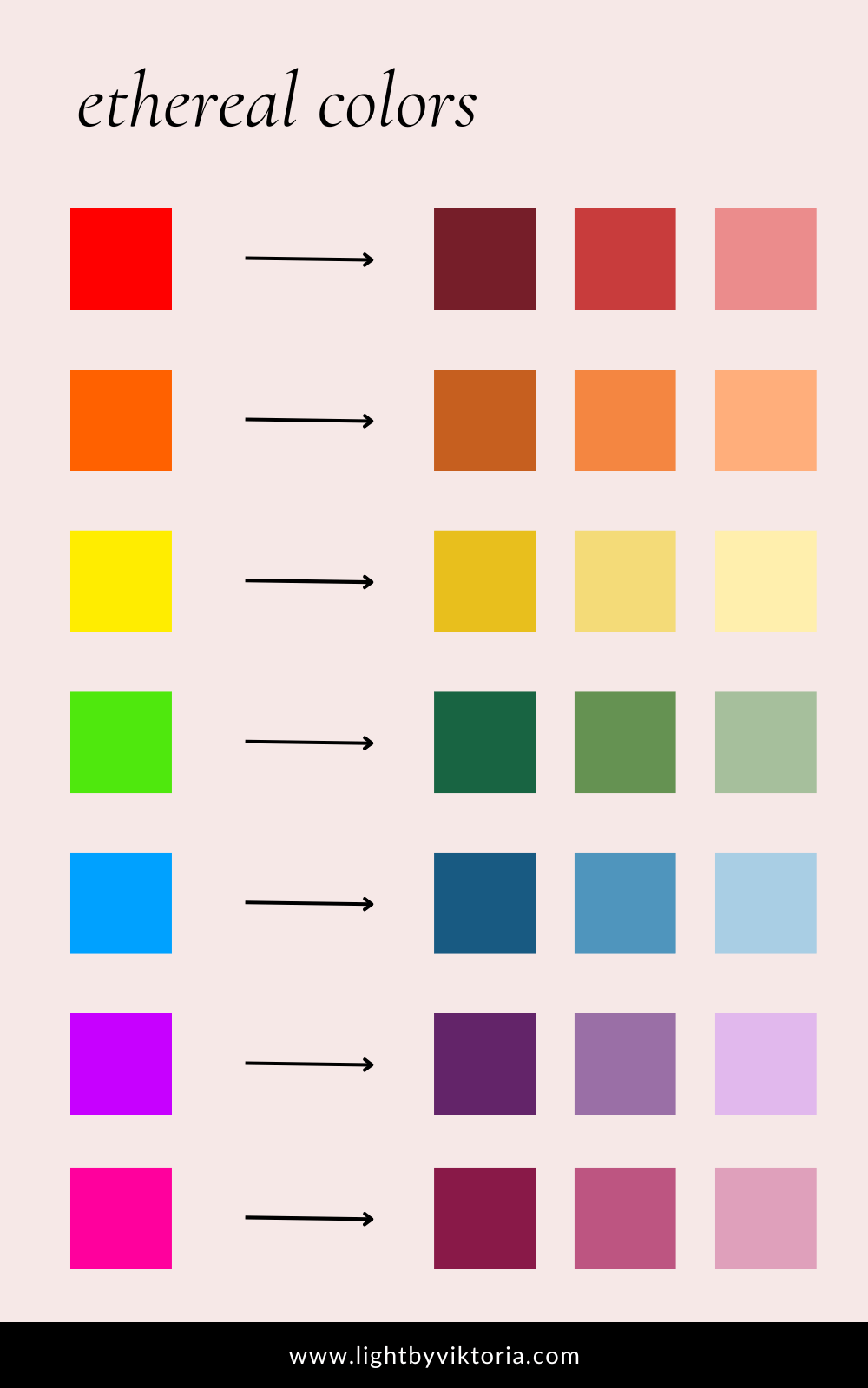
ETHEREAL COLORS FOR YOUR BRAND
- Cool or warm and muted: both cool or warm colors can look and feel ethereal as long as they are low in chroma (greyed, soft, dusty tones).
- Natural, earthy tones: natural shades like off-white, beige, greys, and brown have a calming and otherworldly effect.
- Jewel tones: beautiful and deep jewel tones are truly timeless and whimsical.
- Iridescence: a phenomenon of certain surfaces that appear to gradually change color as the angle of view or the angle of illumination changes. Think mother-of-pearl, butterfly wings, soap bubbles, feathers, and minerals such as opal.
- Gold, silver, and copper: metallic textures add shine and lightness to any brand.
ANTI-ETHEREAL COLORS TO AVOID
- Bright colors: colors that “pop” (a phrase that literally gives me shivers!) is officially a no go when it comes to ethereal hues. Colors like this are way too loud for ethereal brands.
- Neon colors: unless you are mixing cyberpunk with steampunk and Art Nouveau (hello Arcane!) I advise you to stay away from neon colors for the same reason as the bright hues mentioned above.
- Too many colors: using too many colors at once can make your brand look cluttered and heavy the opposite effect of airy-fairy (in a good sense!) ethereal.
Why Color Is Important For Your Ethereal Brand?
Color psychology is a subfield of marketing that studies the psychological effects of different colors on consumers.
Different colors can evoke different emotions in people, and brand owners can use this to their advantage.
For example, blue is often associated with feelings of calm and trustworthiness, while purple is associated with creativity and luxury.
Some brands rely heavily on color to communicate their message. Tiffany & Co., for example, uses robin’s egg blue in its branding to give off a feeling of luxury and sophistication.
When choosing colors for your brand, it’s important to consider what sort of message you want to communicate other than being ethereal.
Do you want your brand to be seen as trustworthy and reliable?
Or elegant and creative?
Once you know what feeling you want your brand to evoke, you can start selecting colors that will help communicate that message.
How To Choose The Right Colors For Your Ethereal Brand?
When it comes to creating a brand, one of the most important elements is choosing the right colors.
Colors can communicate a lot about your brand, from its personality to its values. So how do you choose the right colors for your brand?
Here are a few tips:
- Know your audience. Who are you trying to reach with your brand? What are their demographics? Their interests? Knowing your audience will help you narrow down which colors will resonate with them.
- Consider your industry. What industry are you in? What do other brands in your industry use for their colors? You want to stand out, but you also don’t want to be too out-of-the-box that people don’t understand what you’re going for. Use similar colors to those in your industry, but put your own spin on it.
- Think about the emotions you want to evoke. What feeling do you want people to have when they think of your brand? Do you want them to feel excited? Inspired? Trustworthy? Choose colors that will create the desired emotion in your customers.
Impact of Color On Consumers’ Emotions
Color is one of the most important elements in branding and can have a significant impact on consumers’ emotions.
Different colors can evoke different emotions, so it’s important to choose the right colors for your brand.
- White is the most ethereal color of them all representing elevated purity and elegance.
- Black is white’s moody counterpart expressing depth and sleek sophistication.
- Neutrals like beige, and grey celebrate nature’s palette with an ethereal grace.
- Red is often associated with passion.
- Orange has associations with happiness and fun.
- Yellow is often seen as optimistic and positive.
- Green is associated with nature, growth, and health.
- Blue is often seen as calming and trustworthy.
- Purple can be luxurious, sophisticated, and creative.
- Pink on the other hand is playful, feminine, and innocently sweet at the same time.
The good news is that every color has its ethereal counterpart and you don’t have to settle for colors you don’t like just to fit in some kind of box of creating an ethereal brand.
As you can see in the picture below the ethereal tones are muted, and deeper with the lighter ones resembling almost pastel colors.
There is a special magic to coming up with otherworldly colors and matching them together is an art.
Using Color To Create a Consistent Look and Feel For Your Brand
When it comes to creating a consistent look and feel for your brand, color is one of the most important elements to consider.
The colors you choose for your branding should be based on research into color psychology and how different colors can affect emotions and perceptions.
You’ll want to choose colors that are in line with the overall tone and message you want to convey with your brand.
If you’re targeting a more youthful audience, for example, lighter colors may be more appropriate.
Alternatively, if you’re aiming for a more mature or serious look, darker shades might be better suited.
Once you’ve determined the basic color palette you want to use for your brand identity, it’s important to be consistent in how those colors are used across all touchpoints.
Your website, logo, social media accounts, marketing materials, and any other collateral should all feature the same colors in order to create a cohesive visual identity.
Conclusion
As you can see, ethereal color psychology plays an important role when it comes to giving your brand the perfect look and feel.
By understanding the power of different colors, and how they interact with one another, you can create a unique visual identity that captures the eye of your target audience and helps build an emotional connection between them and your business.
Consider using these tips to give your brand the edge it needs in today’s competitive market and create something truly outstandingly ethereal!
Which ethereal color resonates with you the most? Share your thoughts below, I’m curious!
With love,