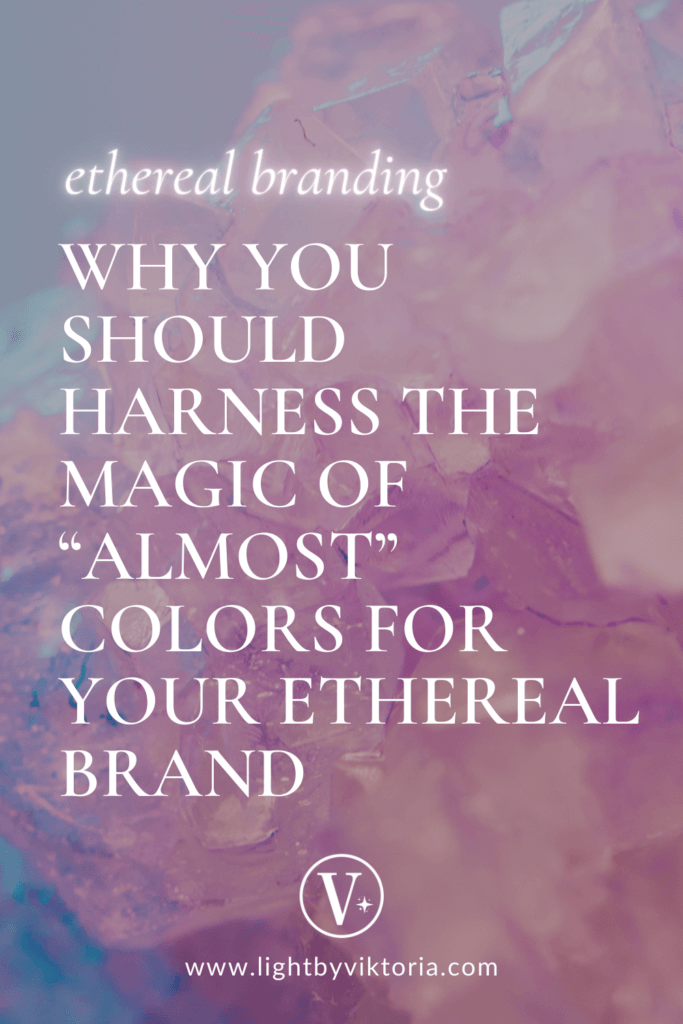
Welcome to the enchanting realm of “almost” colors – very deep purples, greens, blues (almost-black), and extremely light pinks, lavender, and beiges (almost-white) – serving as the cornerstone for an immersive and enchanting branding experience.
In this exploration, let’s delve into the allure of these shades and understand how they can redefine your brand’s visual identity without compromising on depth or subtlety.
Pin this image for later inspiration!
most ethereal colors guide
“Almost” colors introduce a nuanced approach to visual communication, challenging traditional notions about color.
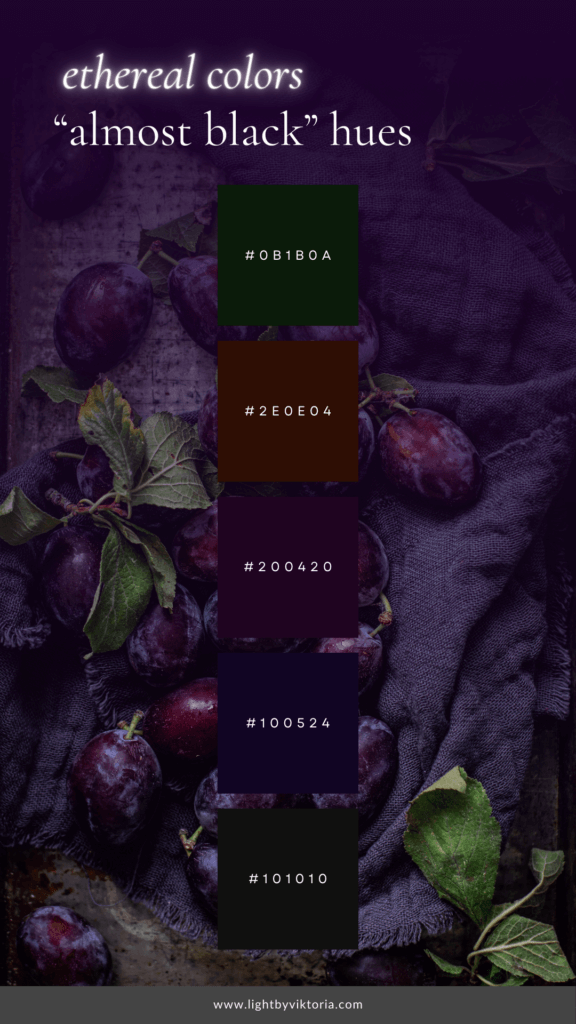
The almost-black palette radiates elegance and sophistication, providing a contemporary twist to the timeless allure of true black.
These rich tones become storytellers, weaving narratives of opulence and modernity with a touch of mystery.
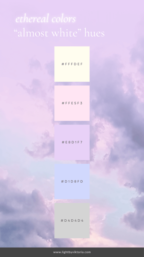
On the flip side, the almost-white palette offers a delicate counterbalance.
These hues encapsulate the purity and simplicity associated with white but infuse it with gentle warmth and approachability.
The lightness of these colors creates an inviting atmosphere, catering to contemporary sensibilities.
Matching them together is like creating an ethereal heaven on Earth.
Together, they create a sensory experience that not only captures attention but also resonates deeply with the emotions and aspirations of your audience.
It’s in this delicate balance that the magic of “almost” colors truly comes to life, offering a transformative journey for both brand creators and their captivated audience.
Almost Black: The Depths of Elegance
When our minds conjure the image of black, sophistication and timelessness are the immediate associations.
However, the overpowering presence of true black can occasionally be overwhelming.
Enter the enchantment of a broader spectrum of almost-black shades, where charcoal, deep purples, forest greens, and midnight blues emerge as exquisite alternatives.
These variations on the black theme retain the elegance and depth we associate with the classic hue while introducing a subtle and mysterious undertone that adds complexity.
Consider the richness of a velvety plum, the depth of poison green, or the allure of midnight blue – each representing a unique facet of the almost-black palette.
These shades, reminiscent of the shadowy corners of a moonlit garden, go beyond being mere colors; they become the nuanced storytellers in the visual narrative of your brand.
A rich plum can evoke regality and opulence, while a deep forest green symbolizes power and mystery.
The midnight blue, reminiscent of the night sky, speaks to depth, and infinite possibilities.
These almost-black hues, with their touch of luxury and sophistication, serve as the ideal foundation for brands aiming to communicate opulence, modernity, and profound depth.
Whether your brand resides in the realms of fashion, or lifestyle, these colors become the building blocks of an ethereal and captivating visual identity, forging a connection with your audience that transcends the surface.
As the spectrum of almost-black expands, incorporating shades like aubergine, navy, and emerald green, brands discover a treasure trove of possibilities to craft a distinctive visual language.
Aubergine, a deep, muted purple, adds a touch of regal elegance, while navy brings a sense of classic refinement.
Emerald green, with its lush and vibrant depth, communicates vitality and sophistication.
By exploring this expanded palette, brands can infuse their visual identity with a richness that captures attention and creates a lasting impression.
In the ever-evolving landscape of branding, embracing the diversity within the almost-black spectrum allows brands to articulate a narrative that is both versatile and powerful.
These nuanced shades offer a visual language that transcends traditional boundaries, creating a brand identity that is not only captivating but also uniquely resonant with the emotions and aspirations of the audience.
Almost White: The Soft Glow of Simplicity
In the lexicon of colors, white stands as a symbol of purity and simplicity, embodying a pristine canvas ready to be painted with the essence of a brand’s identity.
However, the starkness of a true white palette can sometimes lack the inviting warmth that brands seek to convey.
This is where the enchanting world of very light pinks, yellows, and other delicate pastels, collectively known as the almost-white spectrum, comes into play.
Within this spectrum, each color delicately maintains the purity of white while infusing a gentle and inviting glow that transforms the conventional into extraordinary.
Venturing into the realm of almost-white opens a treasure trove of possibilities for brands aiming for a delicate, airy aesthetic.
The subtle variations within this palette allow for the creation of a visual language that radiates openness, approachability, and modernity.
Soft hues like light pink or the warmth of a pale yellow can evoke emotions of tranquility and charm, making them versatile and well-suited for a myriad of industries, from beauty and fashion to lifestyle and wellness.
Expanding our exploration of almost-white, we encounter a spectrum of colors that elevate the visual experience.
Blush pink, reminiscent of a soft sunrise, brings a touch of femininity and warmth.
The delicate apricot hue exudes a sense of understated elegance, while the serene glow of a pale lavender imparts a soothing and sophisticated vibe.
By incorporating these nuanced shades into a brand’s color palette, a delicate dance of pastels unfolds, creating a harmonious visual symphony that captivates and resonates with diverse audiences.
In the world of almost-white, ivory, cream, and champagne emerge as additional gems in the palette.
Ivory, with its subtle warmth and timeless appeal, communicates a sense of refined simplicity.
Cream introduces a touch of richness, exuding sophistication and versatility.
Champagne, with its subtle golden undertones, adds a hint of opulence and celebration.
These shades, when strategically woven into a brand’s visual identity, provide a canvas that goes beyond the conventional, allowing for a narrative that is both inviting and memorable.
As brands continue to explore the expansive possibilities within the almost-white spectrum, the delicate dance of colors becomes a means of self-expression.
The interplay of these subtle hues transcends traditional boundaries, creating an ethereal and captivating visual identity.
The Ethereal Harmony: Crafting a Comprehensive Brand Identity
Let’s explore the delicate balance and harmonious interplay of these colors, unlocking the magic that elevates logos, website design, brand photography, and videography into an ethereal experience for both creators and audiences alike.
- Logo and Brand Identity Design: the magic truly lies in the delicate balance achieved by the interplay of almost colors. These nuanced shades, encompassing the deep richness of almost-black and the soft glow of almost-white tones, create a harmonious and ethereal palette that transcends mere aesthetics, offering a captivating experience for audiences.
- Website Design: an instrumental canvas for this ethereal palette to come to life. The careful integration of almost colors into the digital interface ensures a seamless transition from the brand’s physical presence to its online representation. The deep, rich hues guide users through an immersive and sophisticated experience, while the soft, inviting tones create an online environment that feels approachable and modern. The synergy between almost-black and almost-white provides a captivating visual journey, fostering a connection between the brand and its audience.
- Brand Photography: the exploration of almost colors extends beyond the digital space into the tangible and visual representation of the brand. Almost-black shades lend themselves to creating evocative and dramatic scenes, while almost-white tones infuse a sense of purity and simplicity into the visual storytelling. The ethereal harmony between these colors allows for a dynamic range of photographic expressions, from capturing the opulence of a product to conveying the serenity of a brand’s ethos.
- Videography: as a storytelling medium, becomes a powerful tool in further unraveling the brand’s identity. The play of almost colors in video content adds depth and emotion, creating a sensory experience for the audience. The richness of almost-black shades contributes to a cinematic and luxurious feel, while the softness of almost-white tones ensures a visual narrative that is not only compelling but also resonant.
Conclusion
The delicate balance achieved through the interplay of almost colors goes beyond the realm of mere visual aesthetics.
It becomes a foundational element in crafting a comprehensive brand identity that extends seamlessly across various platforms.
From brand identity design and website aesthetics to brand photography and videography, the ethereal harmony of almost colors serves as the unifying thread that weaves together a brand’s story, capturing the attention and emotions of audiences in a profound and memorable way.
Share your thoughts on “almost” colors in ethereal branding! What’s your favorite shade, and how would you use it for your brand? Comment below and let’s chat about the magic of colors together!
With love,